In September 2015, we launched the O Say Can You See: Early Washington D.C., Law & Family website (OSCYS) [http://earlywashingtondc.org]. The site had an interactive network component, where users could easily see how a petitioner not only had relationships to attorneys and defendants, but to a web of family members and social connections involved in other court cases. What we didn’t know then is that the networks would quickly grow into incredibly tangled webs that would need to be revisited in 2019.

In 2015, before the visualization tool could be born, Laura Weakly and Kaci Nash had already spent hours upon hours recording relationships between all the individuals they could identify in court documents, warrants, minute books, petitions, and more. As the team’s developer, I put myself through a crash course in RDF and SPARQL queries as I worked on figuring out how to present the relationships in a way that could be interrogated, and then I experimented with JavaScript visualization libraries that would allow the results to be explored by users. I settled on the JavaScript InfoVis Toolkit (JIT) [http://philogb.github.io/jit/], inspired by the Social Networks and Archival Context (SNAC) [http://snaccooperative.org/] website’s use of the library. As I recall, I struggled for a little while getting JIT to color lines correctly for the relationships between individuals, but ultimately we ended up with something we were all happy with, we launched the site, and I moved onto the next project.
Laura and Kaci continued adding new documents, however, and that meant adding more people. Soon some of the visualizations were starting to break browser tabs — “Warning: unresponsive script” messages were showing up as the user’s browser scrambled about, frantically trying to draw thousands of points and lines. We restricted judges and clerks from showing up in the visualizations, thinking that since those people were involved in almost all of the court cases and didn’t necessarily have personal relationships with many of the individuals we were most interested in, perhaps this would help the visualization. It continued to limp along, but active attorneys like Francis Scott Key continued to grow into larger and larger monster networks.
Finally this spring, we were able to find time to revisit the project. Although I was supposed to be primarily building a few tools for the project team’s workflow and working on a pretty sweet map, I spent some spare time trying to mitigate some of the worst concerns about the visualizations. Speaking of that pretty sweet map, it’s live now! Take a look at the work Kaci Nash and Patrick Hoehne did putting together a map of Washington, D.C., 1822 directory data, and the people in OSCYS documents here: [http://earlywashingtondc.org/maps/directory_dc],

Back to the visualization: I tried out d3 [https://d3js.org/] first, having worked with it once before for another of Dr. William Thomas III’s projects, Reconstructing African American Mobility After Emancipation, 1865-1867 [http://railroads.unl.edu/mobility-after-emancipation/]. I have found that d3 is very powerful, but also very confusing to quickly pick up and customize for a casual user. I played around for a bit with radial dendrograms and tidy trees, but foresaw a long and mathematical struggle coming when it came to trying to prevent labels from overlapping colorful lines, among other potential hurdles. Another obstacle I encountered is that the radial dendrograms and trees don’t “share” relationships — people in the second-removed set of individuals would be duplicated multiple times for each first-removed individual who knew them. In the current OSCYS visualization, these individuals are shared and the network appears much more “web” like compared to the orderly d3 model. At least for now, without a lot more time to dedicate to learning the dark arts of d3, I decided to keep looking.

I remembered playing around with a library called vis.js [http://visjs.org/index.html] back in 2015 and that I had enjoyed the straightforward documentation and fun “physics” behavior of the points and lines. Unfortunately, the original project is no longer being maintained, but there are enough friendly forks of it that I decided to experiment a little, anyway. If it turned out to be able to handle tons and tons of data points, then one of those community maintained forks might look pretty attractive. I hooked up the SPARQL query to send JSON that the vis.js library could understand and took a look. For people with relatively few connections, it looked beautiful. Changing the points, lines, and labels was easy, it might not be so very labor intensive to modify the OSCYS network code which highlights types of relationships, pan, zoom, and more to use this library.

Yet, vis.js’s greatest challenge remained…….a visualization of somebody like Francis Scott Key! With some trepidation, I put in the URL and hit enter. What followed, I feel, is best represented in images rather than text.


Interestingly, though vis.js was also struggling with that much data, it did display everything for Francis Scott Key (although with an awful lot of spasms and twitches from the physics driving the point location), while JIT wouldn’t necessarily get that far without an awful lot of patience by the user. Finally being able to visualize all of Key’s relationships, however, did make it very clear that at some point we needed to ask ourselves what the visualization was for. Key knew too many people to navigate that type of interactive visual and come away with any particular understanding besides “wow he knew a lot of people through being an attorney.”
So what DID we want to communicate? We wanted to be able to show if a person had many connections or relatively few (keeping in mind these are only to people on the OSCYS site, therefore somehow connected to a court case we’ve documented). We wanted to be able to show the type of relationship (family, legal, social, etc) in such a way that at a glance you can see the proportions of such relationships.
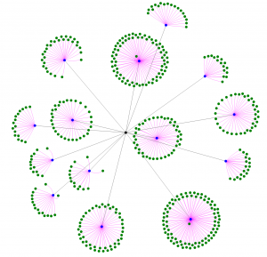
Our imperfect solution was to restrict how many results are coming back and make note of the restriction in the visualization. If a person has several relationships, and one of those related people has dozens and dozens of connections, we are not displaying that particular related person’s secondary connections. If a person has scads of immediate connections, then we do not display the second ring of connections with a relationship to all those immediate connections. This strategy means that the visualization charts are once again usable. You can still get an idea of how well connected an individual was in the OSCYS world with the numbers of omitted individuals. You can still explore the types of immediate connections.

Though the secondary connections may be less accessible, now, it seems less critical to know that a person’s attorney knew many people (which the original person may not have interacted with) through the courts, than that this person had an attorney, a brother, a neighbor, and a slaveholder against whom they were petitioning.
 Network visualization with several individuals’ connections omitted
An unexpected perk of handling the visualization problem through limiting hugely well-connected individuals is that we were able to add clerks and judges back into the mix and so note the number of their relationships, whereas before they were entirely absent from the chart.
I’m not entirely happy with this solution, of course. I would rather find some way to present the networks which is straightforward and usable, but at least for now, the interactive network visualizations have survived when it appeared that this portion of the site might need to be shuttered. Perhaps in the future we will be able to revisit them and find either a new way of presenting the information or come across a new method for presenting them in a similar but more manageable way!